The Project
Snips is a checklist aide for film critics. Critics often watch a movie multiple times to recall important scenes and look at them from a different perspective. Snips aims to save critics the time of their second or third viewing by helping them construct their review more efficiently. It allows critics to keep track of notes, grades and criteria. so that they can keep their review up to their personal and/or professional standard of what constitutes a good movie.
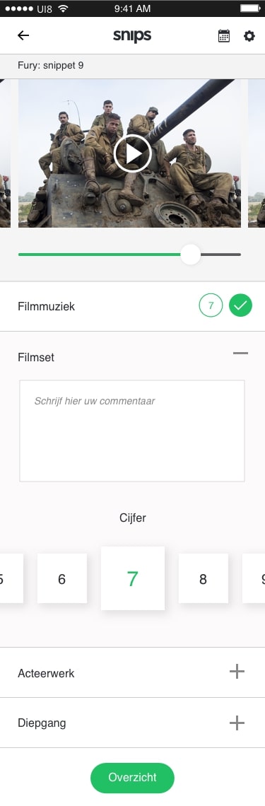
Snips' main feature is the ability to view the film as a collection of short film snippets (snips) that help them recall scenes in the movie they may have forgotten and attach notes and ratings to them. It also features a number of additional tools to help plan and organize their work process. This project was made in close collaboration with my good teammate Jordy van den Berg.
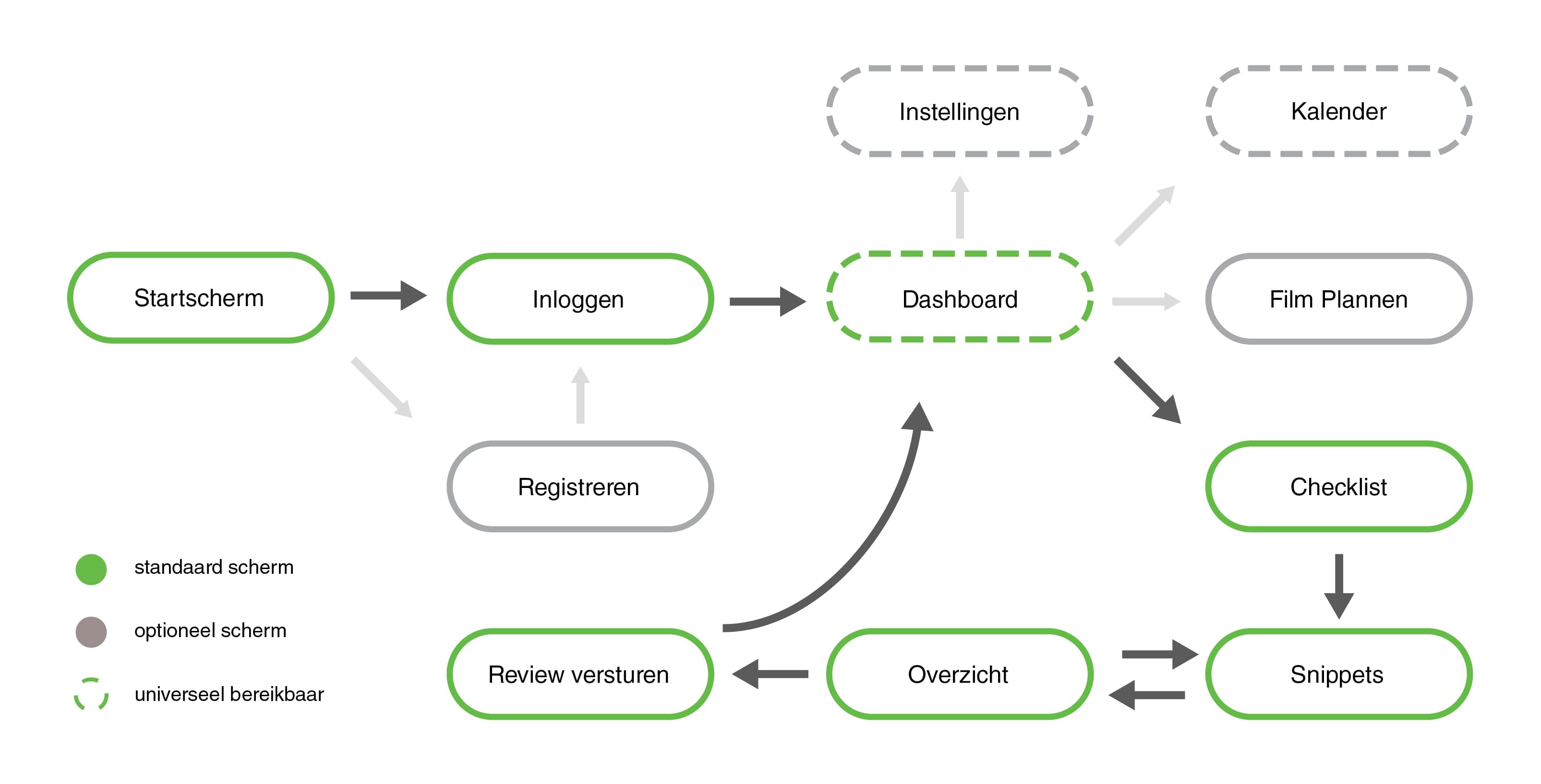
Interaction
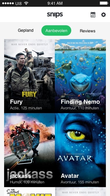
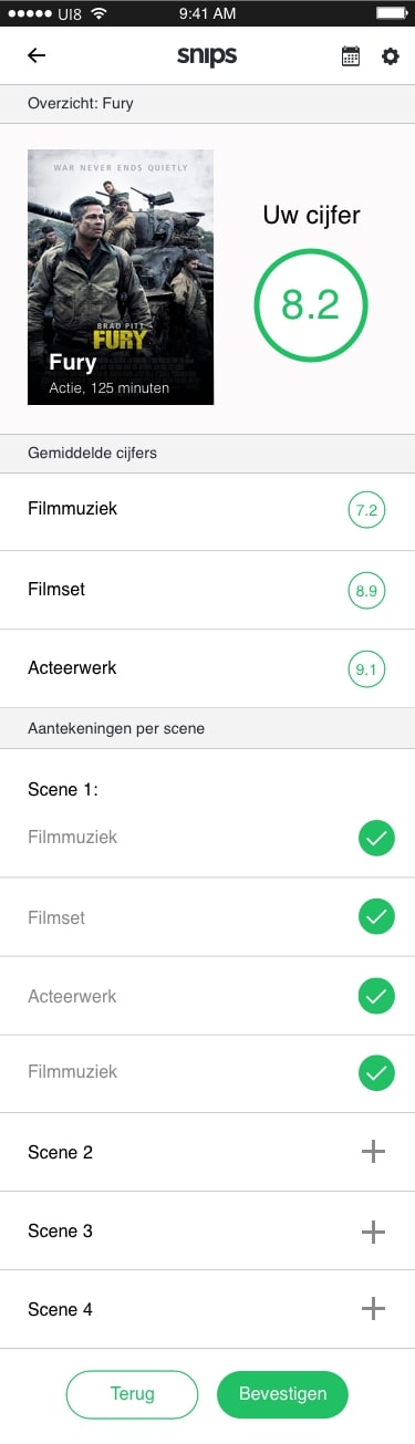
We started the project by discussing how the application would be used. We decided our user would first select the movie they were planning to review. Then, before they go to see the movie, they would construct or import their checklist of criteria. When they had finished their first viewing of the movie they could play back snippets of it on their way back home while making notes and giving grades. At any time the user can look at an overview of the average grades given and notes written.
Sketches
Several sketches were made in order to decide on a final layout for our application. We decided that for each screen that was to be featured we would sketch three different layouts. We experimented with a number of options, tweaking the way information was displayed and looking for the most intuitive design.
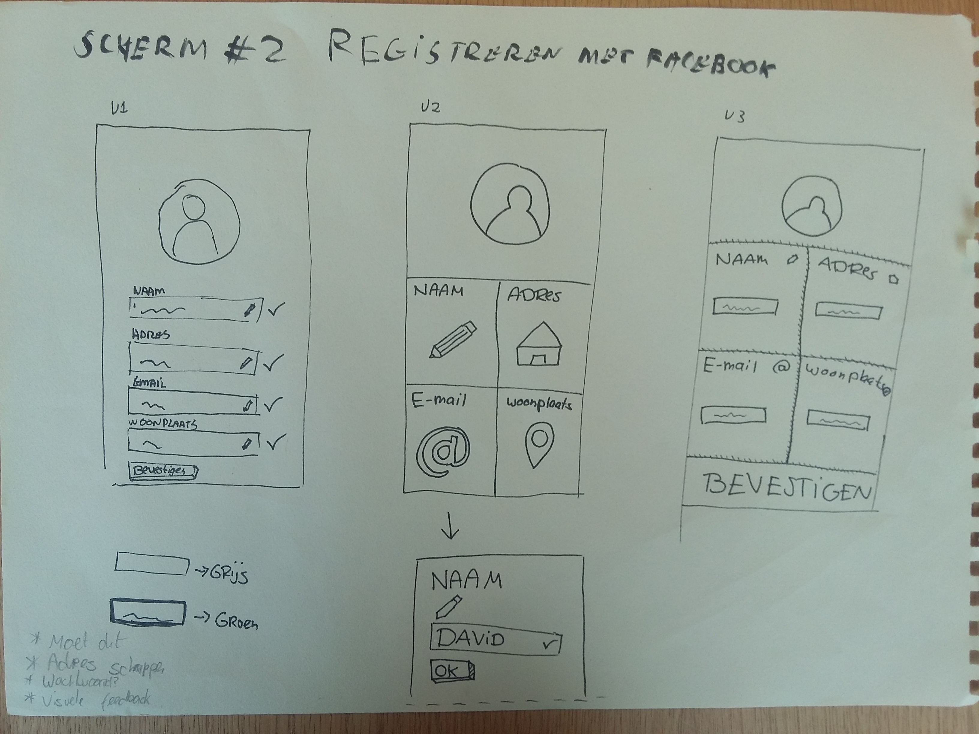
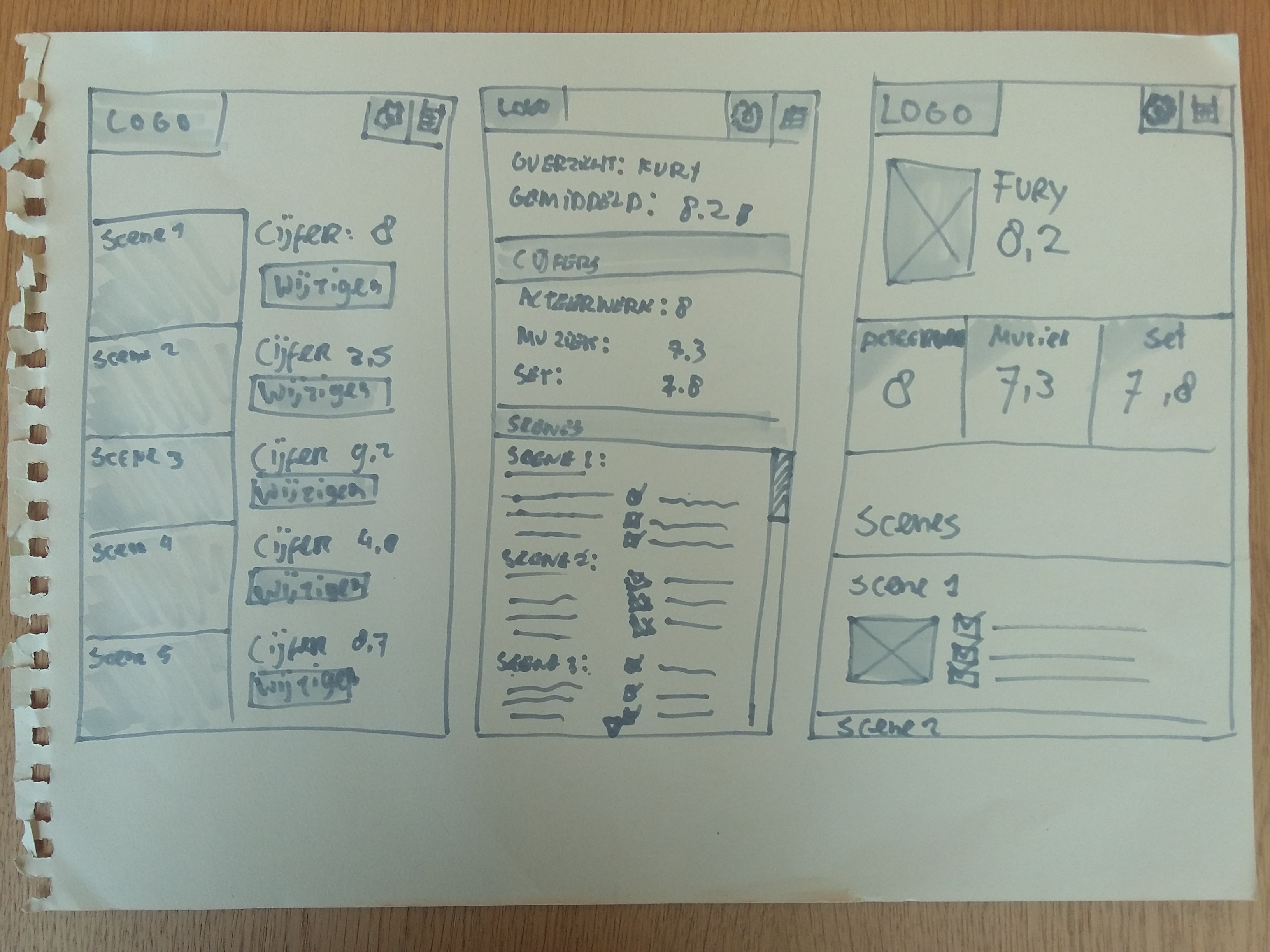
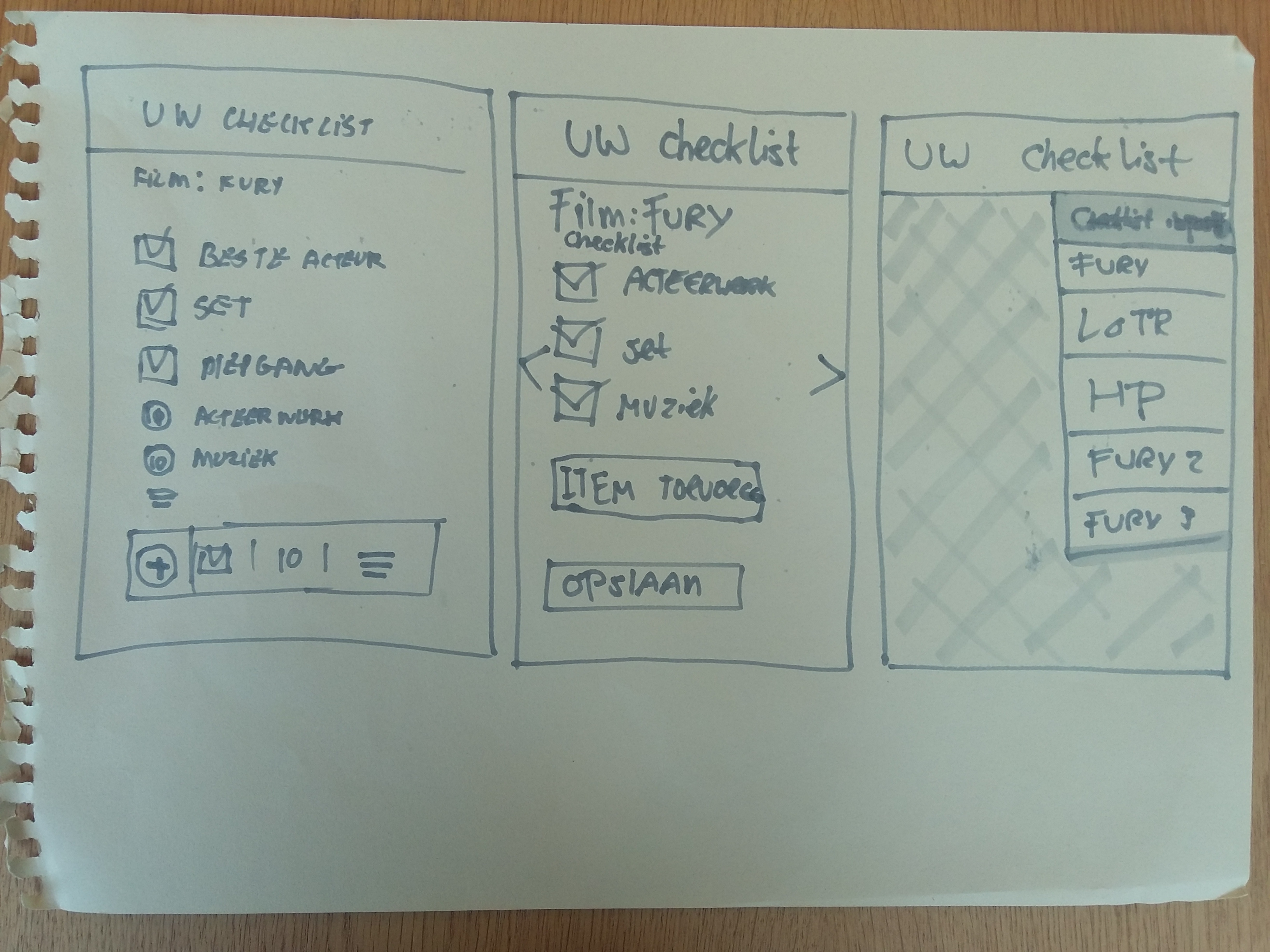
Wireframes
Following the sketching process, we created our wireframes. We tied the layout and interaction to IOS standards to ensure it would be intuitive to all IPhone users.
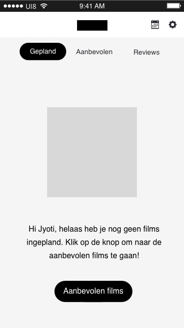
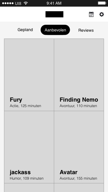
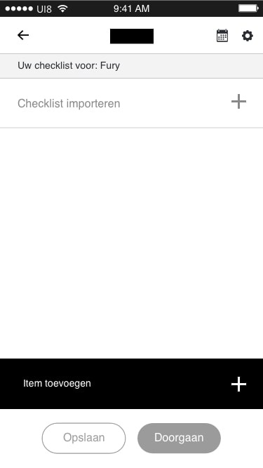
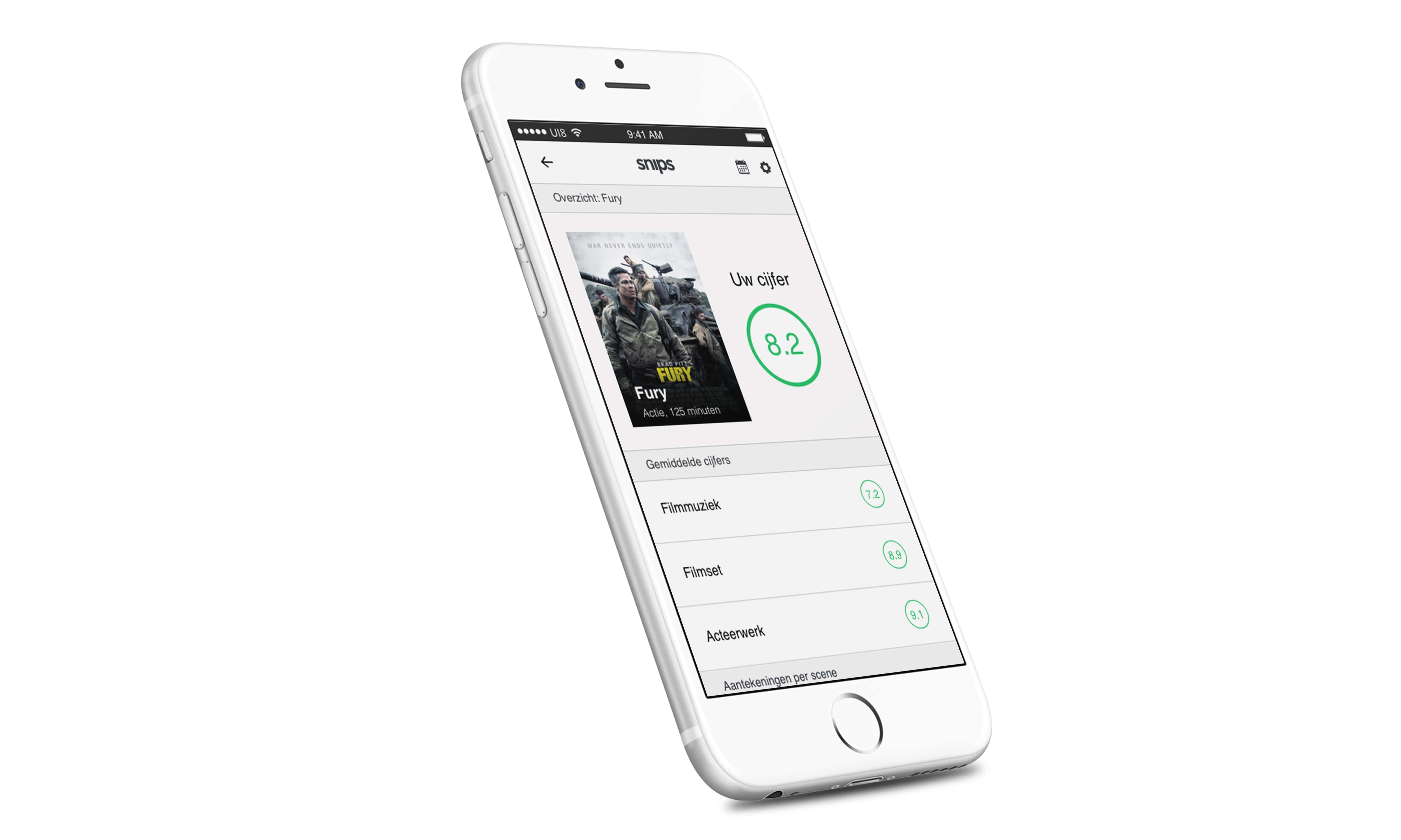
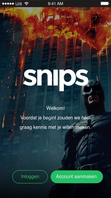
Final Screens
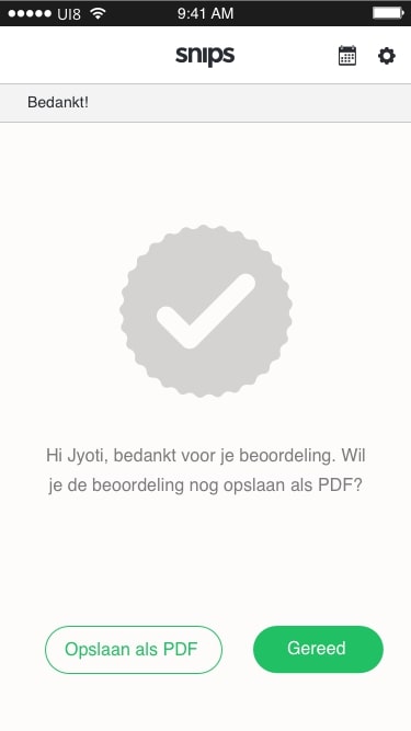
We finished up the final screens by creating a logo. Our style uses a light green colour for accents and a light theme with large amounts of white space to make the interaction task focused without distractions, only drawing attention to important elements.
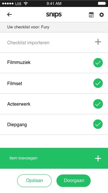
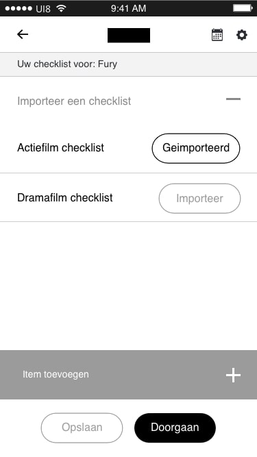
Checklist & Overview
Reflection
I am proud to have worked on this project. It was a great collaborative experience and I am fond of the concept and visual design that have come together so well. I am especially glad we have managed to build an interface that was new, but intuitive enough to be understood and adopted quickly.